Oktoberfest at DRC: Craft Beer Package Design is the New Album Artwork
Album artwork, when properly executed, captures the essence of both the band and its songs, and sets the tone for what lies ahead once you press play. It’s an important part of the overall music experience. Would Pink Floyd’s “Dark Side of the Moon” artwork have decorated the dorm wall of every college stoner for the better part of 3 decades had the design been a boring photo of the band instead of the iconic Prism? The artwork transcends its utilitarian qualities to represent the identity not only of the band or album, but of the person listening to it as well.
When the craft beer movement was in its infancy you could judge the quality of a brew based on how terrible the label design was. If it looked like it was created by amateurs in their garage, you could pretty much guarantee it was a great beer. The same could be said for early punk rock: If the artwork looked like it was made on a photocopier, you knew it was authentic.
Now that the craft beer industry has ballooned to almost 9,000 breweries in the U.S. alone, we’re seeing some amazing works of art and design decorating the side of a beer can. They need to not only capture the essence of the product, but the attention of the consumer as well. A brewery, like a musician, has become part of the identity of the consumers themselves. Beer drinkers line up for new releases, collect limited editions and box sets, and buy all the merch. They pour the beer from the can like pulling a record from its sleeve, and then set the can beside the glass, like their favorite album beside the turntable as they turn it up to 11.
Since it’s the beginning of Oktoberfest 2021, let’s talk about some of our favorite craft beer package designs:
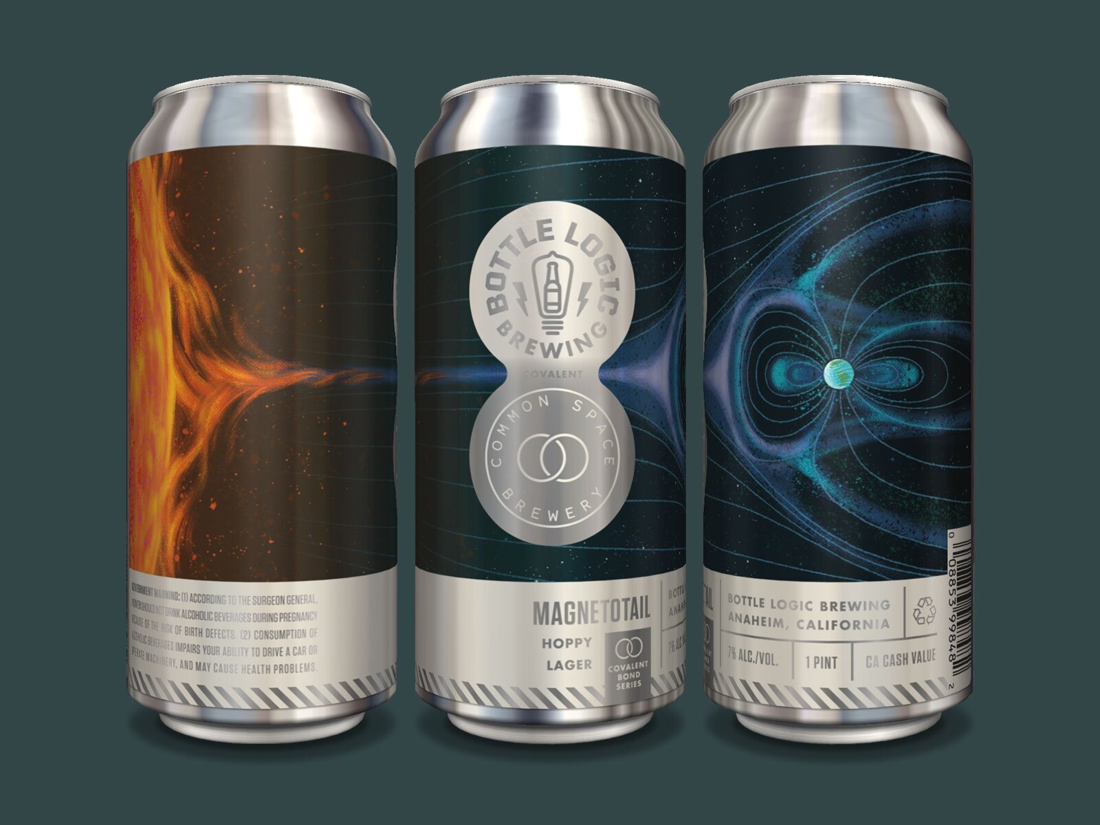
Bottle Logic Brewing (Anaheim, CA) & Common Space Brewery (Hawthorne, CA) - Magnetotail
This label utilizes some crafty techniques to create an overall stunning package. Since inks cannot overprint directly on an aluminum can, the brand opted instead for a full-wrap paper label to achieve the intricately detailed, cosmically awesome illustration of the sun’s effect on earth’s magnetic poles. The one drawback to this technique is that it loses all of the can’s natural metallic luster, so a figure-eight-shaped die cut was stamped-out of the paper label to reveal the Bottle Logic and Common Space logos in opaque white ink against the natural silver can.
Overall Impression: Detailed space illustration, technical production prowess, and gridded, organized information leads me to believe that the brewers wear lab coats and carry clipboards in their sterile space station beer laboratory.
If this beer was music: Progressive Rock.
Fair State Brewing Cooperative (Minneapolis, MN) & Modern Times Beer (San Diego, CA)- Spirit Foul
Another example of using non-conventional printing, Spirit Foul achieves its energetic, multi-colored overprint pattern using a shrink-wrap instead of direct print. The dancing, vibrating, overlapping shapes and colors create a sense of celebration, communicating the juicy, and in their own words “dank,” taste profile of this IPA in an indirect and abstract manner. The label stands apart from anything else in either brewery’s line-up, reinforcing that it is a seasonal, limited-edition release.
Overall Impression: If the label doesn’t make you want to dance, the ABV% will.
Bonus: This design would also look good as 1960’s upholstery.
If this beer was music: Disco.
Beavertown Brewery (Tottenham, London)
There’s something magically attractive about an unapologetically DIY brand. From the super-saturated, comic book doodle-style drawings, to the unconventional naming, the label artwork promises merciless hoppiness and relentless flavor. Names like “Neck Oil”, “Bloody ‘Ell” and “Double Chin” add a layer of delinquent humor a bit too crass for the mainstream, but perfectly suited for Beavertown.
Overall Impression: Everything about this brand indicates the people at Beavertown love what they do, have a glorious good time doing it, and don’t give a damn what anybody else thinks.
If this beer was music: Punk Rock.
Other Half Brewing (Brooklyn, NY) - Daydream Series
Other Half Brewing trades in-your-face branding for consistently beautiful color, shape, and texture. There’s no better example of this than their Daydream series. Ethereal and moody, this lineup is a masterclass in segmentation. It maintains consistent cloud artwork across the portfolio, but each brew gets its own background design and color palette to create a unique expression of flavor. The series holds together as a cohesive system despite the lack of dominant typography.
Overall Impression: This design is so beautiful my mind goes blank when I look at it. Sadly, this isn’t the first time I’ve had a crush on an inanimate object.
If this beer was music: Shoegaze.
MacKinnon Brothers Brewing (Bath, Canada)
Here is a prime example of design capturing that unique brand essence that defines and separates MacKinnon from every other brand. Sketches that could’ve been taken straight from some Westward Expansion prospector’s field notebook reference the MacKinnon Family Farm and it’s 200+ year history, while contemporary typography and a bright, popping color palette add a sense of modernity. The two elements working together tell the story of traditional simplicity meeting modern technique.
Overall Impression: These cans will fit nicely on your reclaimed wood table, alongside your Edison-bulb lamp and vintage typewriter. Now sit back and pour one out into a mason jar, snap your suspenders, and let the frothy suds adorn your Civil War-era mustache.
If this beer was music: You’ve probably never heard of them.


